You've got a gorgeous Pinterest board and a blank coloring page sitting on your desk, and somehow the two refuse to talk to each other. This post is about fixing that — in about a minute.
If you have a Pinterest board full of beautiful images — dreamy landscapes, cozy interiors, vibrant food photography — but you freeze up the moment you sit down with a coloring book or blank paper, this post is for you.
You're not lacking talent. You're just stuck in the gap between the photo and the pencils.
The Pinterest Board of Dreams (That Goes Nowhere)
Here's a pattern almost every hobbyist artist knows:
You spend an hour curating the most gorgeous images on Pinterest. Moody autumn forests. Turquoise ocean coves. Fields of lavender at golden hour. Your board is gorgeous.
Then you sit down to color. You open a page — maybe a Kerby Rosanes animal design, a Johanna Basford garden scene, or a mandala. You look at your pencils. You look at your reference photo. And suddenly you have no idea where to start.
Which pencil matches that specific teal in the ocean photo? Is that shadow more purple or more blue? Should you use warm grays or cool grays for the background? What about the highlights?
So you default to the same handful of safe colors you always use. Or you put the book away entirely.
The problem isn't inspiration — you have plenty. The problem is translation. There's no clear workflow for going from "I love this image" to "these are the exact supplies I should pick up."
Enter the Color Recipe
Here's a trick illustrators use: they work from color recipes — specific, limited palettes chosen *before* they start, based on a reference or a mood.
A color recipe is just a list: these 5–8 specific colors, in this brand, for this project. No more, no less.
Working from a recipe does three things:
1. It eliminates decision paralysis. You're not choosing from your full collection of 72 or 120 colors. You've already narrowed it down to a handful that work together.
2. It guarantees color harmony. Because the palette comes from a single reference image — a photo that already has harmonious colors — your finished piece will have that same cohesive look.
3. It makes you faster. Instead of swapping pencils every few minutes and second-guessing yourself, you work with a tight palette and focus on technique.
How to Build a Color Recipe in 30 Seconds
Here's the workflow, step by step.
Step 1: Pick Your Reference Photo
Open your Pinterest board and choose one image that captures the mood you want. It doesn't have to match your coloring page's subject — a sunset photo can inspire the palette for a mandala. A coffee shop interior can set the tone for a floral design.
The key: pick a photo with 5–7 distinct colors you're drawn to. Overly busy or monochromatic images don't translate as well.
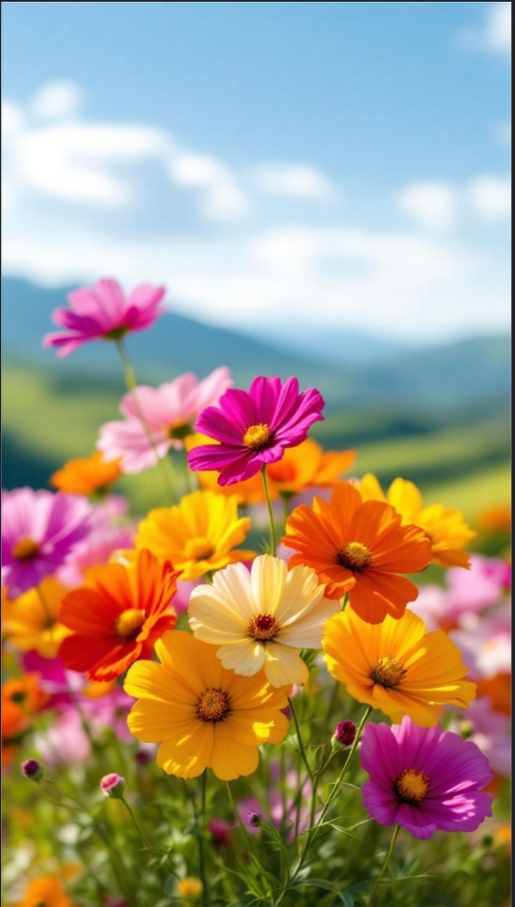
A vibrant garden flower photo — exactly the kind of Pinterest save that makes a perfect color recipe starting point.
Step 2: Upload to MyKindofColor and Create a Palette of Your Choice
Go to mykindofcolor.com and upload your photo. The tool automatically extracts the dominant colors and displays your palette — usually 5–8 key colors pulled from the image. You can adjust the markers to pick what you like.
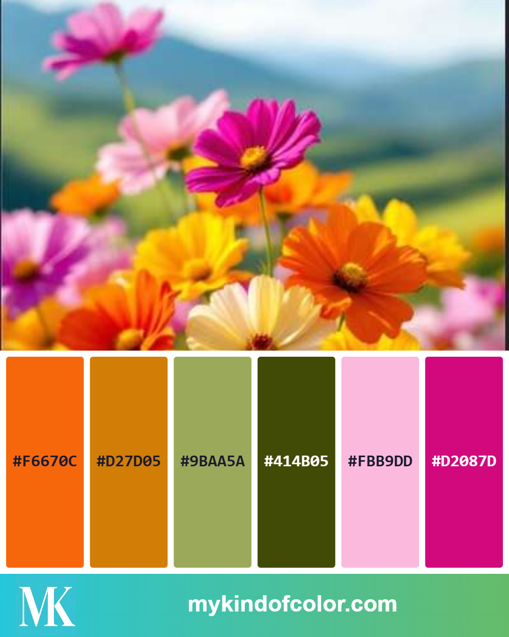
The extracted palette from our garden flower photo — 6 colors with hex codes, ready to match to real art supplies.
Step 3: See Your Supply Matches
Select your brand (Prismacolor, Copic, Faber-Castell, Holbein, Derwent, or any of the supported lines) and the tool shows you the closest match for each palette color, with a quality rating and percentage.
Write down or screenshot this list. That's your color recipe.
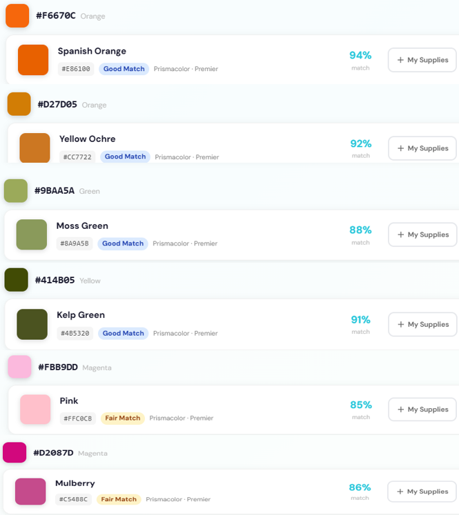
Real results: Prismacolor Premier matches for our flower palette, each with a match quality rating and percentage.
Step 4: Pull Your Supplies
Grab only the supplies on your recipe list. Put everything else away. Seriously — limiting your options is part of the magic.
Step 5: Color With Confidence
Now when you look at your coloring page, you're not making color decisions from scratch. You're executing a plan. Use the lighter recipe colors for main areas, the mid-tones for depth, and the darkest color for shadows and accents.
That's it. The entire process from Pinterest photo to ready-to-color palette takes less than a minute.
Let's Try It: A Weekly Color Challenge
Here's a challenge you can try right now.
The "Golden Hour" Recipe
Think of a warm golden hour photo — the kind with rich amber light, long shadows, and that glowing quality that makes everything look cinematic.
A typical golden hour palette might extract these colors:
In Prismacolor Premier, your recipe might look like:
In Copic:
Pull those five colors, open any coloring page — a landscape, a portrait, even an abstract pattern — and color the entire thing using only those supplies. You'll be surprised how cohesive and professional the result looks, even on a simple design.
Tips for Better Color Recipes
Tip 1: Include a dark and a light. Every good recipe needs contrast. Make sure your palette has at least one color dark enough for shadows and one light enough for highlights.
Tip 2: Let one color dominate. Don't try to use all your recipe colors equally. Pick one as the "star" (usually the mid-tone that covers the most area) and use the others as supporting accents.
Tip 3: Warm palette? Add one cool accent. If your reference photo is all warm tones, that single cool shadow color will make everything else pop. The golden hour recipe above uses Greyed Lavender for exactly this purpose.
Tip 4: Don't stress about exact matches. If the tool shows an 83% match instead of a 95% match, that's fine. Art supplies on paper behave differently than pixels on a screen. An 80%+ match will look great once it's layered and blended.
Tip 5: Save your recipes. Keep a running list — a note on your phone, a page in your sketchbook, or save palettes in your MyKindofColor account. Over time, you'll build a personal library of go-to recipes for different moods and seasons.
Why This Works So Well for Coloring Books
Coloring books are uniquely suited to the recipe approach because the *drawing* is already done. You don't have to worry about composition, proportions, or linework. Your only job is color.
That means the recipe is your entire creative decision. Choose a good one and the piece practically colors itself. A botanical illustration colored with a cohesive autumn recipe will look dramatically different from the same illustration colored with a tropical recipe — and both will look intentional and polished.
This is also a fantastic way to get more mileage out of the coloring books you already own. Instead of coloring each page once with "whatever feels right," try the same page with three different recipes — a warm one, a cool one, and a monochromatic one. You'll learn a surprising amount about color by the end of the week.
Your Turn
Here's how it might go tonight:
That's it. No swatching for hours. No staring at your supplies wondering where to start.
Just pick a photo, get your recipe, and go.
---
Want a fresh challenge every week? Follow us on Instagram @mykindof.color and Pinterest for weekly color inspiration and recipe ideas.
Here’s something to get you started:
Five Free palettes and their closest matches in your brand.
Five palettes I keep reaching for, paired with the closest matches in your brand. Pick one, pour tea, and start.
Free to try, no account needed. We'll only email you about the palettes you ask for.