Plumeria flowers are one of those subjects that seem impossible to get wrong — until you try to color them. The petals shift from buttery gold at the center through warm coral to soft pink at the edges, and if your markers don't follow that same gradient, the whole thing falls flat.
So before I picked up a single marker, I uploaded my reference photo to MyKindofColor and let it show me exactly what was going on in that image.
The Reference Photo
A cluster of plumeria in full bloom — those gorgeous gradient petals that shift from golden peach to coral to pink, with deep crimson buds and rich tropical greens behind them. This is the kind of photo that calls for warm, layered coloring.
The Extracted Palette
Six colors pulled straight from the photo:
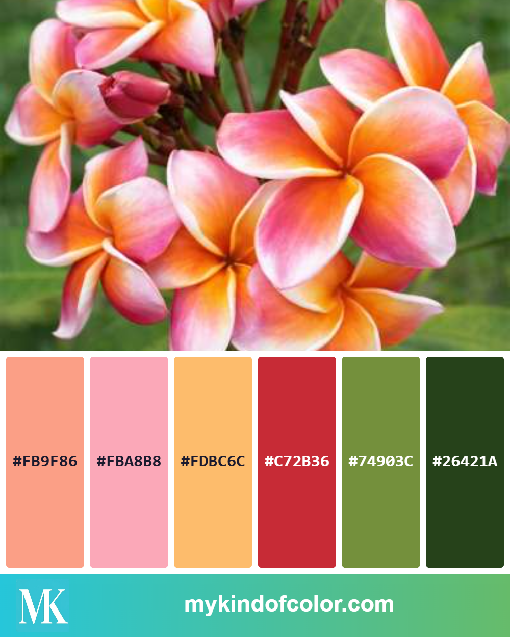
A beautiful tropical floral palette using one of my Pinterest inspirations
| Swatch | Hex Code | What I See |
|--------|----------|------------|
| 💗 | #FB9F86 | Soft coral — the warm blush across each petal |
| 💗 | #FBA8B8 | Soft pink — the lightest outer petal edges |
| 🟡 | #FDBC6C | Golden peach — the warm glow at the center of each bloom |
| ❤️ | #C72B36 | Deep crimson red — the unopened buds and petal bases |
| 🟢 | #74903C | Olive green — the sunlit side of the leaves |
| 🟩 | #26421A | Dark forest green — deep leaf shadows |
The Altenew Marker Matches
What I love about this palette is that it maps almost perfectly across just two Altenew marker sets I already own: Cosmic Garden (Set A) and Mediterranean Terrace Garden (Set B).
For the petals — blending warm to cool:
For the leaves:
How I Built This Card
I colored this using Altenew's Beautiful Day stamp set — it has those open, layered florals that are perfect for marker blending. Here's the layering order I follow:
Petals (inside out):
Start with Buttercream at the center of each petal, working outward. Layer Warm Sunshine over the inner third to deepen the gold. Transition to Coral Berry through the middle — light, feathered strokes that blend into the yellow. Finish the outer edges with Frosty Pink. For the buds, go straight to Ruby Red and soften the edges with Coral Berry.
Leaves:
Forest Glades first as the base tone, then deepen with Evergreen in the shadow areas. Leave some white space or very light Forest Glades near the leaf veins for dimension.
Finishing touches:
I stamped with Altenew Permanent Black ink (it plays beautifully with alcohol markers) and added dark splatters for texture. A simple "Thanks" sentiment from Sweet Sentiments completed the card.
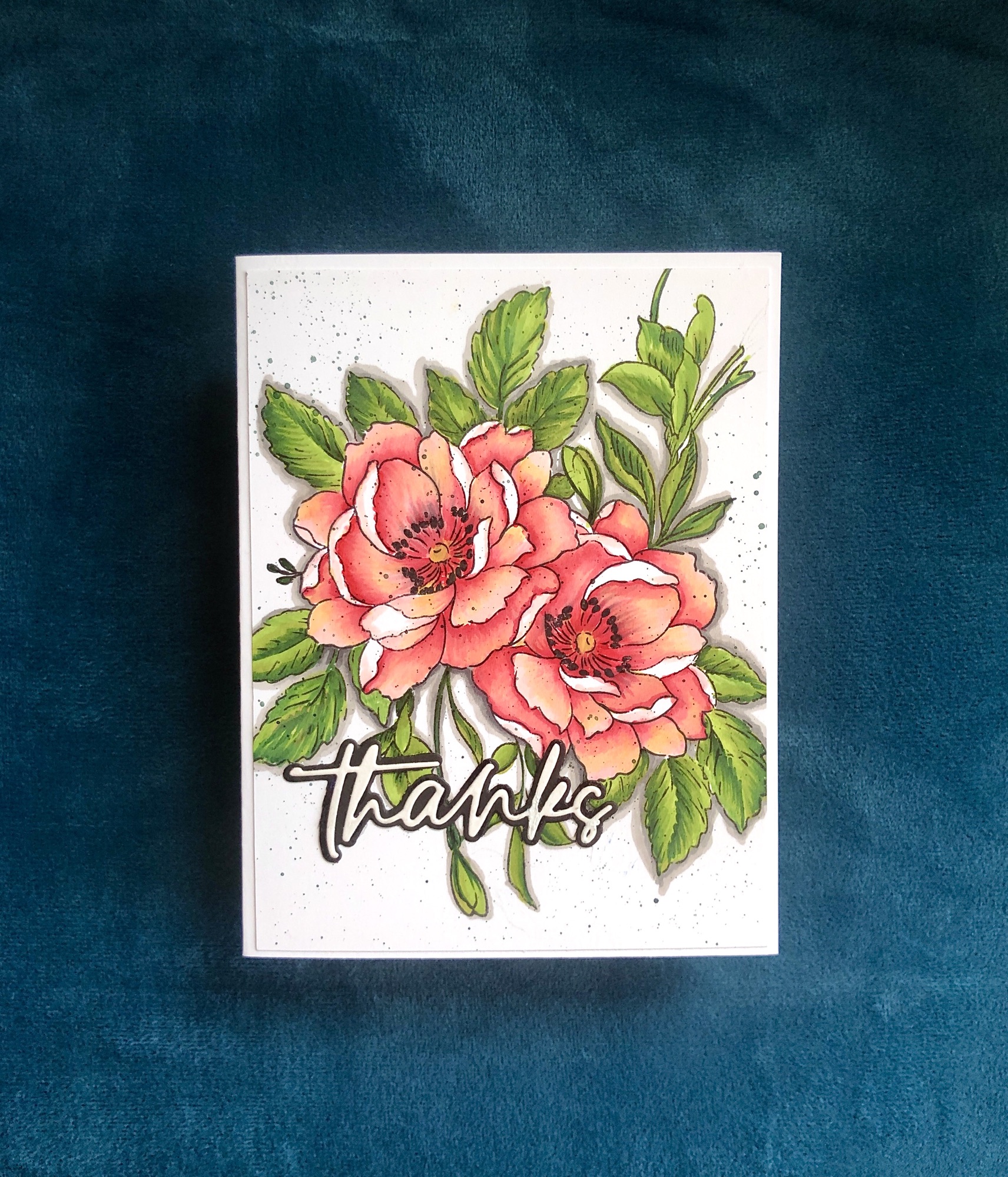
An eye catching mix of colors that just elevated my floral card to another level.
Why Two Sets Is Enough
This is what surprised me most: I didn't need to pull from five or six marker sets. Two sets — 24 markers — covered every color in this tropical palette. When you see the hex codes laid out next to the marker names, you realize you probably already own what you need. You just need to see the match.
That's the whole point of extracting a palette first. It turns "I have 60 markers and no idea which ones to grab" into "I need these six."
Your Turn
Upload any reference photo to MyKindofColor — it's free to start. See the hex codes, match them to your Altenew markers (or pencils, or inks), and start coloring with confidence.
Your photo. Your brands. The exact match.
---
Supplies used in this post: