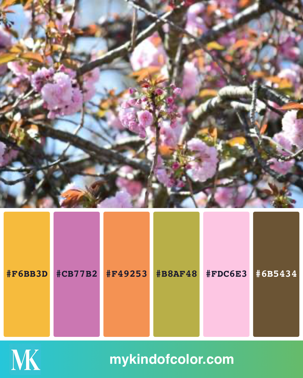
There's a cherry blossom tree in my neighborhood that does something strange in late April. The blossoms are pink — pale, almost lavender-pink — but the new leaves coming in behind them are this rusty, peachy orange. And the bark is dark chocolate brown. And the sky behind it all is the softest blue.
When I saw it I thought: that's not a "spring" palette. That's six colors I would never have put together on purpose, and they're gorgeous.
I took a photo. I uploaded it to MyKindofColor. And by the time I was back at my craft desk, I had the matching Altenew markers pulled out and ready to go.
This post is the whole walk-through — the photo, the palette, the markers, and the thank-you card I made with them. If you've ever stared at a beautiful photo and wished you knew which of your supplies actually matched it, this is the post for you.
---
The photo

A blurry phone snap. Honestly. I wasn't trying to take a beautiful photo — I just wanted to remember the colors before they were gone.
That's something worth saying out loud: you do not need a good photo for this to work. You need *your* photo. The one that made you stop. The lighting can be off, the focus can be soft, the framing can be terrible. The colors are what matter, and the colors are still there.
---
The palette
Six colors pulled from the photo:
| `#F6BB3D` warm yellow |
| `#CB77B2` dusty pink-purple |
| `#F49253` peachy orange |
| `#B8AF48` olive-yellow green |
| `#FDC6E3` pale pink |
| `#6B5434` dark warm brown |
Look at this palette in isolation, without the photo. Six colors that — on paper — sound chaotic. Yellow and pink and orange and olive and pale pink and dark brown? That's a lot.
But it works because nature already balanced it. The dark brown anchors everything. The pale pink and the dusty pink play off each other instead of competing. The olive green is the bridge between the warm pinks and the warm yellow. And the peachy orange is the surprise — the unexpected note that makes the whole thing sing instead of feeling like a generic spring palette.
This is what I love about pulling colors from photos: the photo has already done the hard work of figuring out what looks good together. You're just finding the right markers.
An fresh mix of pink, rose, orange and green using one of my photo inspirations
---
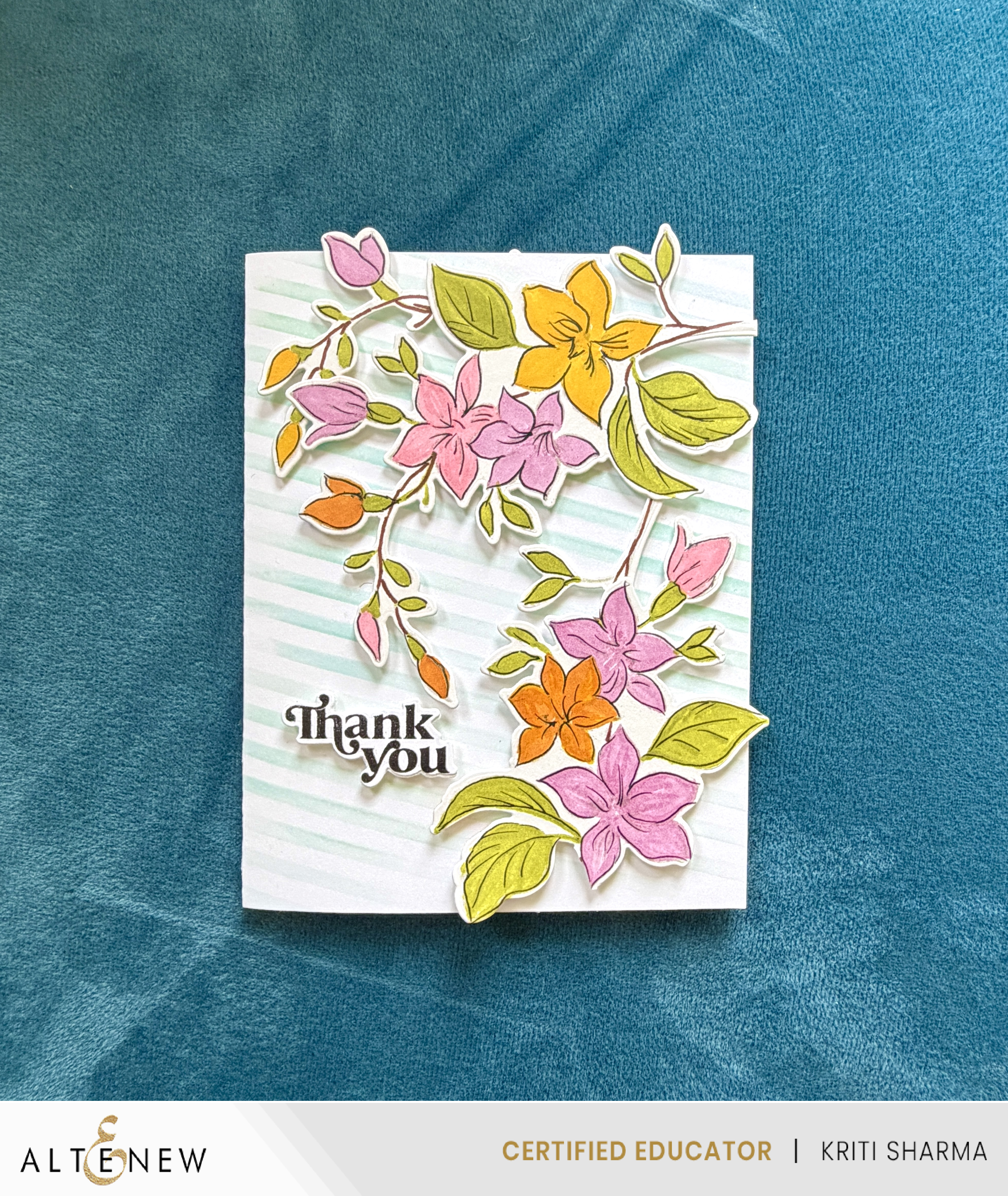
The matches — Altenew alcohol markers
Here's where MyKindofColor saved me probably 30 minutes of swatching. I uploaded the photo, set the brand filter to Altenew, and got these matches:
| Palette color | Altenew marker |
|---|---|
| `#F6BB3D` warm yellow | Maple Yellow |
| `#CB77B2` dusty pink-purple | Puffy Heart |
| `#F49253` peachy orange | Orange Cream |
| `#B8AF48` olive-yellow green | Bamboo / Parrot |
| `#FDC6E3` pale pink | Pink Diamond |
| `#6B5434` dark warm brown | Dark Chocolate |
Plus — and this part wasn't from the palette, this was just me playing — I used Sea Glass ink on a striped stencil for the background. The pale aqua pulled the whole card together, picked up that bit of sky from the original photo, and made the warm tones in the florals pop.
If you have these markers in your collection, you can recreate this exact look. If you have *different* markers — Copic, Ohuhu, Polychromos — you can match the same palette to your own brand at mykindofcolor.com. Same six hex codes. Different supplies. Same result.
---
The card

I used a floral stamp set I've had forever — one of those "I'll use this someday" stamps that actually got used. The blossoms got Pink Diamond and Puffy Heart. The bigger statement bloom got Maple Yellow. The pop of warmth came from Orange Cream on the buds and one full flower. Bamboo for the leaves, with a touch of Parrot in the shadows. Dark Chocolate for the linework.
The background is the Sea Glass ink swiped through a striped stencil at a slight diagonal — gentle enough not to fight the florals, but enough texture that the card doesn't feel flat.
The "Thank you" is a simple black sentiment, tucked into the lower left where there's open space.
It came together in about 45 minutes. Most of which was actual coloring. Not swatching. Not auditioning markers. Not staring at my desk wondering which yellow.
That's the whole point.
My Thank you card using the Altenew alcohol markers and the Best mom stamp die set
---
Why this matters (the part that's actually about you)
I built MyKindofColor because I was tired of losing the first hour of every craft session to color decisions.
Sit down with tea. Open the supplies. Find a photo I love. And then — squint. Swatch. Audition. Reject. Try again. By the time I was actually coloring, the kids were awake or my back hurt or the moment was gone.
That's the gap between *seeing* a color and *finding it in your collection*. It's a real gap. It's not a personal failing. It's just the size of the problem when you have 200 markers and one bouquet on your desk.
MyKindofColor closes that gap. You upload a photo. We tell you which of your supplies match. You sit down and color.
Your supplies are enough. You just needed a faster way in.
---
Try it with your own photo
Take a photo this week — your garden, a coffee cup, a dress in your closet, a sunset, a coloring page reference, anything that made you stop. Upload it at mykindofcolor.com. It's free to start. No account needed.
You'll get the exact markers, pencils, or ink pads in your stash that match each color in the photo. Across 21+ brands.
And then — sit down and color.
---
Want a head start?
If you're an Altenew user, I made a free Five Palettes — Altenew Edition PDF. It includes five hero palettes (slow pour, autumn leaves, lanterns, lavender sunset, peonies) with the closest Altenew alcohol marker and ink matches for each.
Get the free Altenew palette pack →
It's the fastest way to see what photo-to-supply matching can do for your next coloring session.
---
Your Turn
Upload any reference photo to MyKindofColor — it's free to start. Extract your palette, see the hex codes, and match them to the Altenew inks (or colored pencils, or markers) you already own. No more second-guessing at the craft table.
Your photo. Your brands. The exact match.
---
Supplies used in this post:
Written by an Altenew Certified Educator (AECP Level 3)
Here’s something to get you started:
Five Free palettes and their closest matches in your brand.
Five palettes I keep reaching for, paired with the closest matches in your brand. Pick one, pour tea, and start.
Free to try, no account needed. We'll only email you about the palettes you ask for.